Composition Principles for Clear Images
The purpose of composition
Composition organises visual information so an image reads clearly. Good composition is not a set of rigid rules but a toolbox for guiding the viewer’s eye, emphasising what matters, and creating a satisfying structure. Start with small studies to test arrangements quickly.
Thumbnails first
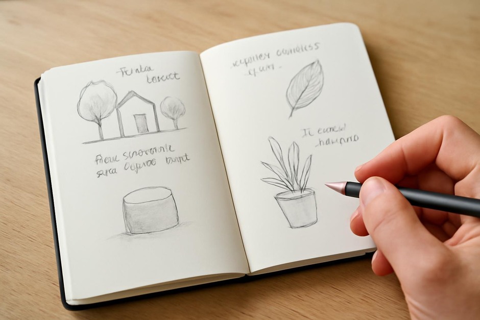
Thumbnails are tiny sketches that explore composition without detail. Use several thumbnails to test cropping, the location of the focal point, and the balance of dark and light. This lightweight step prevents costly decisions later and frees you to experiment with different structures.
Focal point and hierarchy
Decide what the viewer should notice first and make it clear with contrast, value, colour, or edge clarity. Surrounding elements should support the focal point by leading the eye or providing context, not competing for attention. Establishing a clear hierarchy keeps an image readable.
Balance and tension
Balance can be symmetrical or asymmetrical. Asymmetrical balance is achieved by offsetting a strong focal point with visual weight elsewhere—such as a dark shape, a bright spot, or texture. Slight tension often makes a composition more engaging than perfect symmetry.
Leading lines and movement
Lines—actual or implied—guide the eye through a picture. Use them to connect elements and to suggest movement or a path. Diagonals and curves provide dynamic flow; horizontal lines can stabilise a composition. Be mindful of where lines point and how they reinforce the focal point.
Simplification and negative space
Remove unnecessary details that distract from the main idea. Negative space can define shapes and give the eye room to rest. Simplification clarifies relationships between objects and strengthens the overall message of the image.
Edge control and clarity
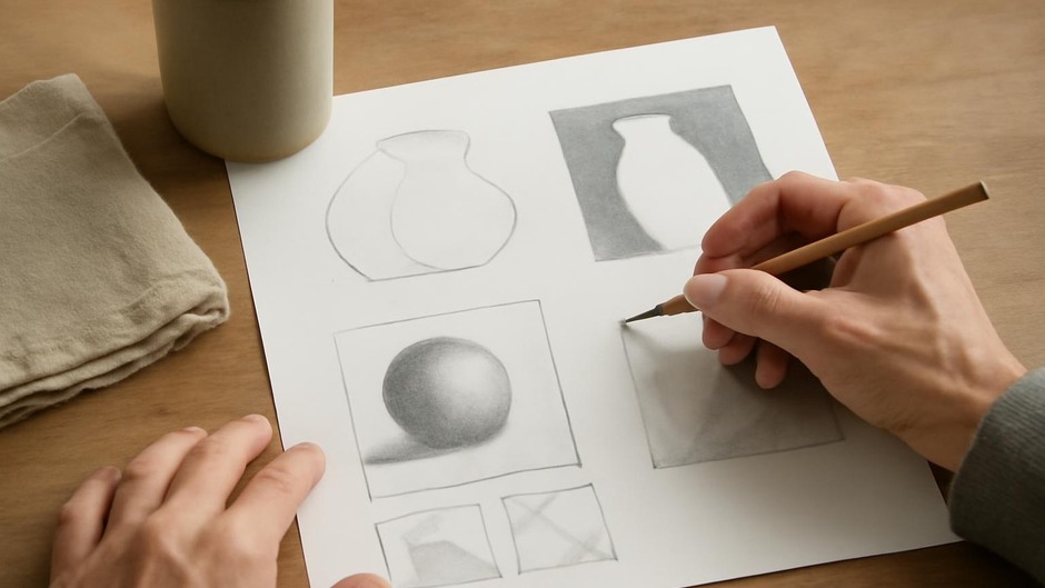
Edges communicate focus. Sharper, darker edges attract attention while softer, lost edges suggest distance or subordinate information. Use edge control intentionally: sharpen around the focal point and soften secondary areas.
Contrast and scale
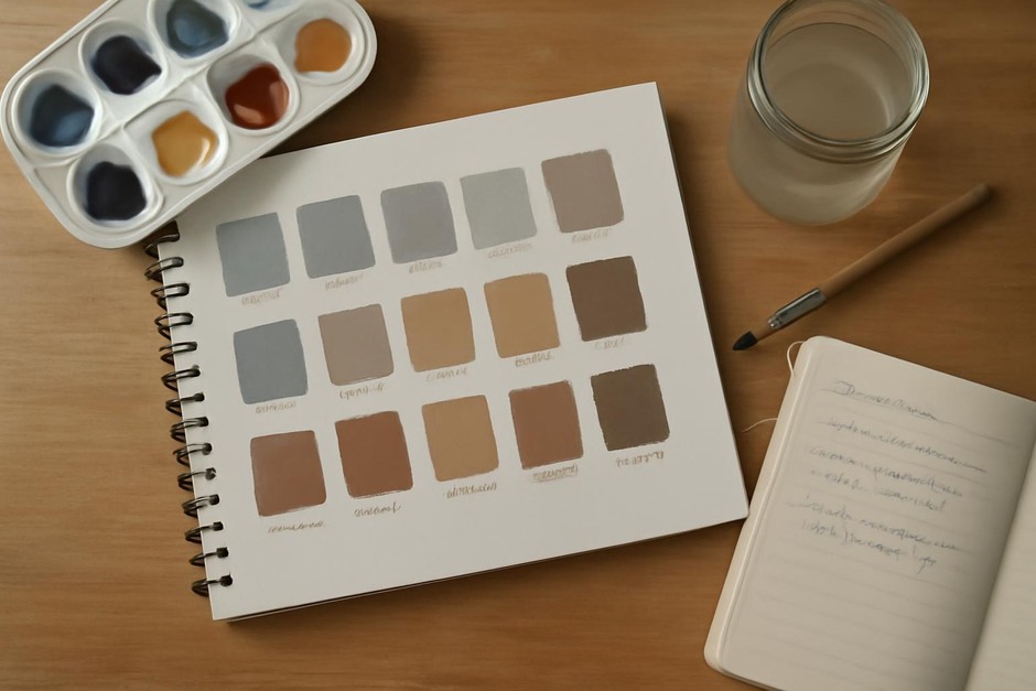
Contrast in value, colour, or texture establishes emphasis. Scale differences can also indicate importance; a larger form generally appears dominant. Test contrast in thumbnails and adjust shapes and tones until the desired balance is achieved.
Iterate and test
Work through multiple small compositions rather than committing to the first layout. Crop a study more tightly, move the focal point slightly, or adjust tonal relationships until the arrangement reads clearly. Iteration is the fastest path to reliable decisions.
Final thought
Composition practices are flexible tools for solving visual problems. When thumbnails, clear hierarchy, deliberate leading lines, and careful edge control are combined, images gain clarity and purpose. These principles are practical and repeatable, helping creators build images that communicate with calm confidence.